
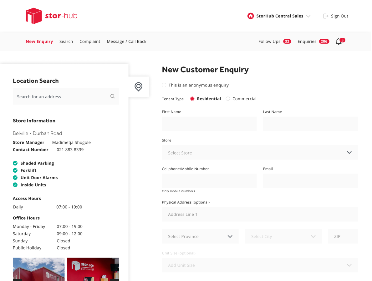
Nomad Now’s original interface struggled to meet the growing demands of a dual-sided marketplace, where both job seekers and hirers required clarity, efficiency, and trust throughout the hiring lifecycle. Complex workflows, inconsistent UI patterns, and limited communication tools made it challenging to manage inquiries, contracts, and interviews at scale, leading to user confusion, platform misuse, and inefficient task handling.
The redesign introduced a structured, modern UI that supports high volume hiring workflows while remaining intuitive for occasional users. With persistent navigation, semantic colour systems, and modular form patterns, the new interface enhances decision making, communication, and onboarding. Every aspect, from profile setup to correspondence, is built to reinforce platform integrity, transactional confidence, and ease of use.


The Nomad Now job seeker and hirer platform underwent a comprehensive UI/UX redesign aimed at improving usability, visual clarity, and transactional trust between freelance professionals and hiring managers. The platform serves as a managed marketplace, and the redesign had to strike a delicate balance between the robustness of an enterprise SaaS tool and the approachability of a talent marketplace. Every design decision, spanning layout, navigation, colour system, and UI component, was grounded in this duality.
The primary goal was to improve end-to-end task flows: placing inquiries, managing interviews, messaging between parties, updating profiles, and monitoring hiring progress. With clarity and consistency as guiding principles, the interface was rebuilt around a modular component system and strong information hierarchy.
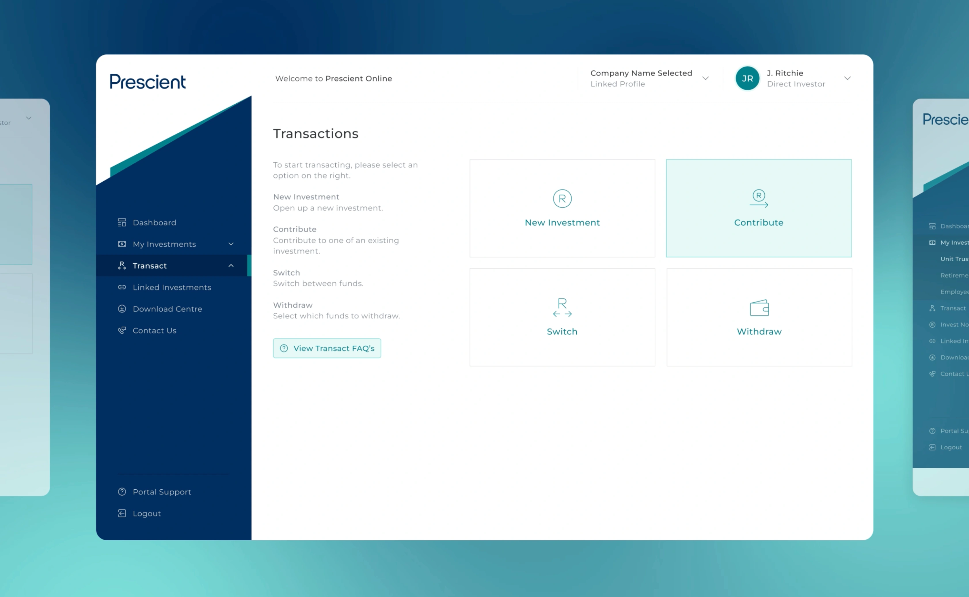
- Persistent Sidebar Navigation with a fixed sidebar provides always-accessible entry points to Search, Inbox, Admin, and Profile sections, reducing task-switching friction
- Contextual side panels (e.g., user cards or metadata) sit beside primary task areas like messaging or inquiry forms, allowing users to act without losing reference dat
- Long and complex forms are broken into well-spaced sections, with advanced options (like fee splits and templates) revealed only when necessary
- Sortable, filterable tables allow hirers to triage inquiries and job types efficiently, with colour-coded status badges that improve scanning
- Each job includes a dedicated messaging thread with WYSIWYG formatting tools and file upload support, encouraging clear, professional communication
- Job seekers can showcase work through image cards and linked case studies, offering both visual and editorial portfolio options
- Monthly and weekly availability calendars help hirers plan engagements and job seekers manage multiple commitments with clarity
- All engagement information - dates, location, contract terms, and remuneration - is clearly displayed in print-friendly, scannable formats
Layout & Navigation
Persistent Sidebar Navigation
A fixed sidebar on the left-hand side provides intuitive access to primary actions: “Search”, “Inbox”, “Talent”, “Teams”, “Profile”, and “Admin”. This reduces context-switching friction for both hirers and job seekers who frequently toggle between views such as inquiries, messages, and profile settings. Nested sections, such as “Profile” and “Admin”, can be expanded or collapsed, keeping the interface clean while maintaining the discoverability of subpages.
Persistent left-hand navigation is a familiar paradigm in SaaS platforms. By keeping tools in a consistent location, users can build a reliable mental model of the system, reducing cognitive load and making it easier to return to tasks after interruptions.
Two-Column Page Structures
Key workflows, including inquiries, correspondence, and interview details, are structured around a two-column layout. The left-hand column provides contextual information, such as the job seeker’s details or job metadata, while the right-hand pane houses the active interaction, like messaging or data entry.
Separating context from action allows users to reference necessary details while performing tasks, which is especially important in platforms where transactional decisions are made quickly. This also prevents the need for repeated navigation or backtracking across screens.
Colour Scheme & Visual System
Neutral Base, High-Contrast Actions
The visual design features a restrained, neutral background of white and light grey, serving as a clean base. Accent colours are used with purpose – mint green for primary actions (like “Send” or “Accept Interview”) and a broader palette of red, orange, grey, and green for status indicators.
By using bold colours sparingly and in consistent contexts, the interface avoids visual fatigue while making it immediately clear where action is required. This approach supports both usability and accessibility for high-volume users working across multiple orders or talent records.
Tags & Badges for State
Status and metadata are communicated through visually distinct pill-shaped tags. These are used across the inbox, inquiry pages, and profile details to indicate states like “Accepted”, “Pending”, “Declined”, or to represent working days and contract types.
Using tags enables rapid scanning and triaging of job-related information, turning otherwise verbose content into compact summaries. They serve as lightweight yet effective data visualisations embedded in the interface.
Forms, Inputs & Messaging
Well-Structured Forms
The redesign introduces clear, accessible forms throughout the platform – from creating a new inquiry to updating a hirer’s profile. Fields are grouped logically and spaced generously, making long forms less intimidating. Conditional logic reveals advanced settings like “Fee Split” or “Template Saving” only when necessary, avoiding overload.
Segmenting information this way helps users stay focused on the core action while still offering flexibility for advanced users. It’s especially beneficial in a platform where both frequent and infrequent users coexist.
Rich Text Editors
In areas such as correspondence and project descriptions, a lightweight WYSIWYG editor allows formatting options like bold, italic, lists, and links. These are intentionally limited to ensure consistency while enabling users to communicate job requirements clearly.
This enhances professionalism in communication without introducing unnecessary complexity or formatting inconsistencies. It supports structured input while reducing the need for attachments or excessive back-and-forth.
Empty States & Platform Guidance
When a message thread has no history, the interface provides a welcome message along with platform policy reminders, encouraging users to keep communication within Nomad Now.
This reinforces correct usage patterns and reduces the likelihood of off-platform transactions, which is important for compliance and dispute resolution in managed marketplaces.
Tables & Job Listings
Inbox & Message List
The inbox presents orders, interviews, and inquiries in a structured table format with sortable columns and filters. Each row contains service, role, status, job seeker, job type, and date. Icons help distinguish categories, and colour-coded tags make it easy to identify priority items.
The table mimics the functionality of a professional email client but is optimised for hiring workflows. This makes it immediately usable for hirers who need to triage responses quickly and keep track of multiple candidates across stages.
Detail Pages
Pages like “Inquiry Details” and “Interview Request” are structured in clearly labelled blocks, listing key information such as dates, locations, working hours, and contract terms. Buttons for actions like “Accept” and “Decline” are positioned in logical proximity to this context.
Using a structured key-value layout improves information retrieval speed and reduces errors in interpreting job expectations. These pages are designed to be printable and easily scannable for record-keeping or sharing with internal teams.
Profile, Calendar & Gallery Views
Job Seeker Calendar
The job seeker calendar view offers both month and week toggles, allowing users to visualise availability and upcoming engagements. The weekly view breaks down time slots in hourly intervals, while the monthly view enables high-level planning.
This dual-view setup supports both strategic planning and day-to-day task management, catering to different styles of use. It’s particularly helpful for hirers managing overlapping contracts or job seekers juggling multiple gigs.
Job Seeker Gallery
Job seekers can showcase their work through a grid of portfolio cards. These include image previews, platform links (e.g. YouTube, UX Magazine), and document thumbnails. Some content is hosted natively, while others open in new tabs.
The card-based layout emphasises visual storytelling while still accommodating editorial or long-form work. This flexibility helps candidates stand out and gives hirers a quick impression of relevance and quality.
Messaging & Communication Tools
Correspondence Threads
Each job engagement has its own correspondence thread, complete with message history, a formatting-enabled editor, and file attachment support. Threads are isolated per order to ensure clarity and traceability.
This format encourages professional, contract-specific communication and helps resolve misunderstandings by keeping all messages in context. The availability of file attachments and formatting elevates the platform beyond basic chat into a tool fit for negotiation and project setup.
Design System Cohesion
Throughout the application, a consistent design system underpins every element: typography scales, spacing tokens, consistent form components, and repeated interaction patterns. Inputs, buttons, tags, and alerts are visually and functionally aligned across the platform.
This visual and interaction consistency increases user confidence and reduces onboarding time. It also ensures that new features can be added rapidly without introducing inconsistency, making the system scalable for future enhancements.
The redesigned Nomad Now portal transforms a transactional hiring platform into a high-trust environment for freelance engagement. It leverages modern UX patterns to support a wide range of user journeys – from quick inquiry placements to detailed portfolio reviews and complex contract structuring.
By prioritising clarity, structure, and a professional tone, the new design increases efficiency for hirers and empowers job seekers to represent themselves more effectively. It preserves the core value of the platform – efficient talent engagement – while adding new layers of usability, compliance, and polish.
- Design System Architecture
A consistent component and spacing system ensures design scalability and visual coherence across all modules. - Figma Variables & Component Tokens
The redesign was systemised using Figma’s latest features, including variables for colour modes, spacing, and typography to support multi-brand flexibility. - Semantic Colour & Status Mapping
Colour-coded badges and tag components map directly to job, user, and platform states, supporting accessibility and fast scanning across lists.

.webp)

.png)